


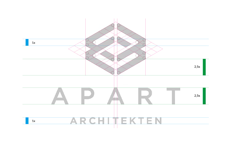
For Apart Architekten, a newly founded architecture firm in Tofino, Canada, we developed a fresh, contemporary corporate design. The visual identity reflects the firm’s architectural approach: clean lines, functional elegance and a strong sense of structure. The result is a unified design system of logo, typography, color palette and imagery that forms the basis for all future brand applications – from stationery and project presentations to the digital presence. The young firm starts out with a professional, recognizable identity that can grow with its projects.